
If you work in Quality, Production, Lean Manufacturing, Six Sigma or Continuous Improvement, you deal with data every day.
Measurements. Rejection numbers. Cycle times. Process parameters. Customer complaints. Inspection results.
But looking at a long list of numbers does not always tell us what is really happening in the process.
This is where a Histogram becomes useful.
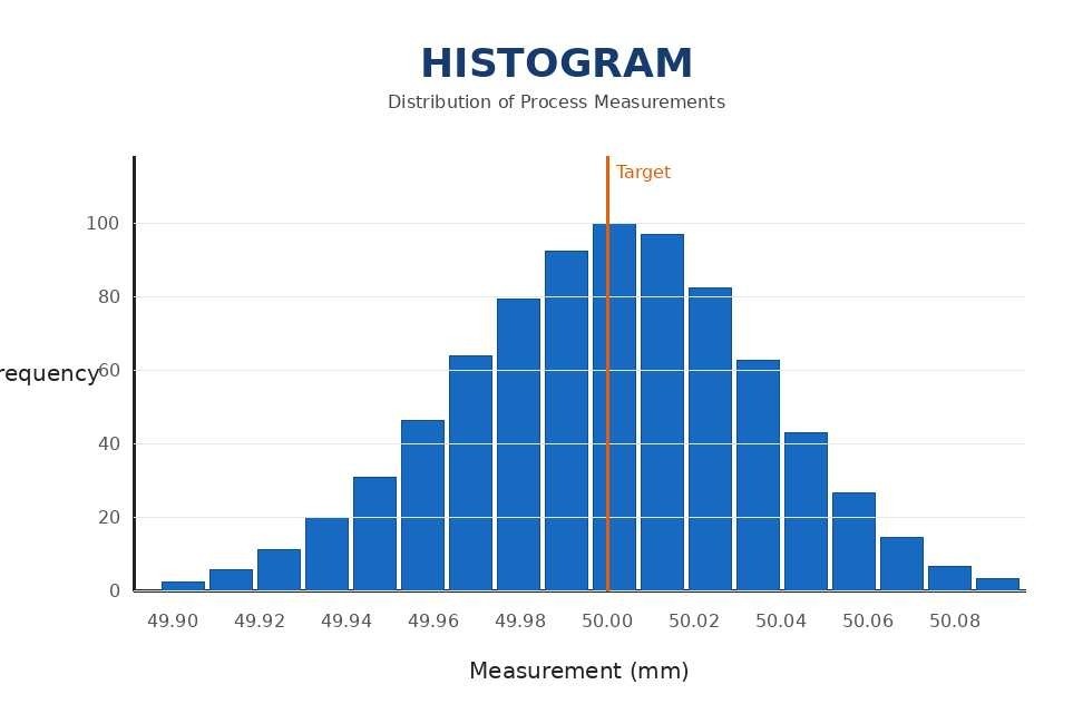
A histogram takes a set of numerical data and converts it into a simple visual picture. Instead of looking at 100 or 500 individual measurements, you can immediately see where the data is concentrated, how much variation exists and whether the distribution has any unusual pattern.
That makes the histogram one of the most useful tools for understanding process variation.
What is a Histogram?
A histogram is a graphical representation of the distribution of numerical data.
The measurements are divided into ranges called bins and the number of observations falling into each range is shown using bars.
For example, imagine you are measuring the diameter of a component.
You collect 100 measurements ranging from 19.92 mm to 20.08 mm.
Looking at all 100 values in an Excel sheet may not tell you much.
But when you plot them as a histogram, you may immediately see that most measurements are concentrated between 19.98 mm and 20.03 mm.
Now the behaviour of the process becomes much easier to understand.
This is the real purpose of a histogram.
It helps us see the distribution of the data.
What Can We Learn From a Histogram?
A good histogram can answer several important questions.
Where is the data concentrated?
How much variation is present?
Is the distribution symmetrical or skewed?
Are there unusual values?
Are there two different groups within the data?
Is the process output close to the specification limits?
These questions are extremely important in manufacturing.
For example, two processes can have exactly the same average but completely different levels of variation.
Process A may produce almost everything close to the target.
Process B may have measurements spread widely across the specification range.
If we look only at the average, both processes may appear similar.
The histogram tells us the difference.
A Simple Manufacturing Example
Suppose the specification for a component dimension is:
Target = 50.00 mm
LSL = 49.90 mm
USL = 50.10 mm
You collect 100 measurements.
The average comes out to 50.01 mm.
At first glance, this looks good.
But now you create a histogram.
If most measurements are between 49.98 mm and 50.04 mm, the process appears reasonably concentrated around the target.
Now imagine another process where the average is also 50.01 mm but the measurements are spread from 49.91 mm to 50.10 mm.
The average is almost identical.
The process behaviour is not.
This is why we should never depend only on the average when analysing a manufacturing process.
Average tells you the centre. Histogram helps you understand the distribution.
Understanding Different Histogram Patterns
One of the most useful skills for a Quality Engineer is learning how to read the shape of a histogram.
Symmetrical Distribution
The data is reasonably balanced around the centre.
This may indicate a relatively consistent distribution, although the histogram alone does not prove that the data is statistically normal.
Skewed Distribution
Most observations are concentrated on one side and the distribution has a longer tail on the other side.
This can happen in processes where there is a natural lower or upper boundary.
For example, waiting time, processing time and many financial or reliability measurements can be skewed.
Bimodal Distribution
This is particularly interesting in manufacturing.
You may see two distinct peaks.
For example, suppose measurements from two machines are combined.
Machine 1 produces around 49.95 mm.
Machine 2 produces around 50.05 mm.
When both datasets are combined, the histogram may show two peaks.
This is a signal to investigate further.
Separate the data by:
Machine
Shift
Operator
Product model
Supplier
Tool
Production line
Sometimes the histogram is telling you that two different processes have been mixed together.
Wide Distribution
If the histogram is very wide, it may indicate excessive process variation.
The next question should be:
Why is the process variation so high?
Possible factors could include machine condition, material variation, tool wear, operator method, environmental conditions or measurement variation.
Outliers
A few observations may appear far away from the main distribution.
Do not simply delete them.
Investigate them.
An unusual measurement could be a data-entry error, measurement error or a genuine process event.
The outlier may actually provide an important clue about the process.
How to Create a Histogram
Creating a histogram is straightforward but the quality of the analysis depends heavily on the quality of the data.
1. Define what you are measuring
Be clear about the characteristic.
For example:
Component diameter in mm.
Cycle time in seconds.
Weight in grams.
Torque in Nm.
Do not mix different characteristics into one dataset.
2. Collect representative data
Collect data from the actual process.
If possible, include normal production conditions rather than collecting data only when everything is running perfectly.
The data should represent the process you are trying to understand.
3. Identify the minimum and maximum
Find the lowest and highest values.
This gives you an idea of the overall range.
4. Select suitable intervals
Divide the data into meaningful ranges.
These ranges are called bins.
The number and width of bins can influence how the distribution looks.
Too few bins may hide important information.
Too many bins can make the chart unnecessarily noisy.
5. Plot the frequency
Count how many observations fall into each range.
The horizontal axis represents the measurement range.
The vertical axis represents the frequency.
The resulting chart gives you a visual representation of the distribution.
Histogram vs Bar Chart
This is a common question in Quality interviews.
A bar chart is normally used to compare categories.
For example:
Scratch defect
Dent defect
Paint defect
Assembly defect
A histogram is used to analyse the distribution of numerical data.
For example:
Component diameter
Cycle time
Temperature
Weight
Torque
There is another visual difference.
In a histogram, the bars normally touch because the intervals represent continuous numerical ranges.
Histogram vs Pareto Chart
These two tools answer different questions.
A Pareto chart helps answer:
Which problem or category is contributing the most?
A histogram helps answer:
How is my numerical data distributed?
For example, if you are analysing different types of defects, Pareto is useful.
If you are analysing the dimensional variation of a component, histogram is more appropriate.
Both can be used together during a problem-solving project.
Histogram and Six Sigma
The histogram is particularly useful during the Measure and Analyse stages of DMAIC.
For example:
Define: Reduce dimensional rejection.
Measure: Collect 100 or more dimensional measurements.
Analyse: Create a histogram and study the distribution.
Investigate: Compare the distribution by machine, shift and operator.
Improve: Address the major source of variation.
Control: Continue monitoring the process using suitable control methods.
The histogram does not solve the problem by itself.
It helps the team understand what the process is doing so that the next investigation is based on evidence rather than assumptions.
Histogram and Process Capability
A histogram becomes even more useful when specification limits are shown.
For example:
LSL | Process Distribution | USL
You can visually see whether the process output is concentrated around the target or whether a significant portion of the distribution is approaching the specification limits.
For a proper capability study, however, additional statistical analysis is required.
Measures such as Cp and Cpk provide numerical information about process capability under the appropriate conditions.
So remember:
Histogram = Understand the distribution
Control Chart = Understand process stability over time
Cp/Cpk = Evaluate capability against specification
These tools complement each other.
Common Mistakes When Using a Histogram
One common mistake is creating a histogram simply because a project requires a chart.
The chart should answer a question.
Another mistake is using poor or non-representative data.
Another is combining different populations without checking them separately.
For example, combining data from three machines may hide the fact that one machine is producing significantly different results.
And one of the biggest mistakes is assuming that a histogram automatically tells you the root cause.
It does not.
The histogram shows the pattern.
You still need process knowledge, stratification and other Quality tools to understand the reason behind that pattern.
Create a Histogram Online
Creating a histogram manually in Excel is possible, but when you are working with Quality projects, training, audits or daily process analysis, a simple online tool can save time.
That is why we created an Online Histogram Generator for Quality and Manufacturing professionals.
You can enter your numerical data and quickly generate a professional histogram without spending time formatting charts manually.
The tool is designed for:
Quality Engineers
Production Engineers
Process Engineers
Lean Professionals
Six Sigma practitioners
CI Managers
Manufacturing Excellence teams
Students and trainers
It can be useful for process studies, Six Sigma projects, quality investigations, training and data analysis.
Create Your Histogram Online
Enter your data. Generate the chart. Understand your process.
Final Takeaway
A histogram may look like a simple chart, but it can reveal a lot about a process.
It can show where your measurements are concentrated.
It can show the amount of variation.
It can highlight skewness and unusual observations.
It can reveal that two different populations have been mixed together.
And it can help you decide where to investigate next.
But always remember:
A histogram shows you what the data looks like. It does not tell you why it looks that way.
That is where a Quality professional adds value.
Observe the pattern.
Stratify the data.
Ask why.
Go to the process.
Verify the suspected cause.
Then improve the process.
That is how a simple histogram becomes a powerful part of data-driven Continuous Improvement.
